A QR code on screen asks the viewer to stop watching and pick up their phone. It only works when the reason is obvious in that moment, the code is easy to scan from across the room, and the page it opens keeps the promise the video just made.
For a creator agency, an on-screen code is one of the few placements nobody else controls: no crowded description box, no algorithm deciding who sees the link. In the jeruo demo workspace, QR codes are the smallest source and the best converter, at 22.4% visit-to-lead against 16.2% for YouTube links. The numbers are illustrative, but the reason holds anywhere: someone who reaches for their phone mid-video has already decided they want the thing.
When to show it
Show the code at the moment the problem comes up, not in the outro. If Alex Finance is walking through how he splits a paycheck, with his budget spreadsheet on screen, that is the moment: the viewer is looking at the exact thing they could have. On the end screen, the same viewer is deciding what to watch next.
The outro is easy to edit in, which is why calls to action end up there. It is also where the audience is smallest: everyone who left early never sees it.
Mark the moment in the edit brief
Editors cannot guess where the moment is. Mark it in the script or edit brief with a timestamp and the asset, for example "04:12, budget spreadsheet on screen, show QR." If the video has two natural moments, use both. An outro appearance is fine as a backup, never as the only one. And skip the first 30 seconds: before viewers know what the video is about, a code is noise.
How big and how long
The same video plays on phones, laptops and living-room TVs. The phone is the awkward case: a viewer watching on their phone cannot point that phone at its own screen. The code is for laptop, tablet and TV viewers, so it should always travel with the same link in the description.
For everyone else, the code has to survive distance, video compression and a few seconds of fumbling:
- Size. Bigger than feels comfortable. A code that scans from the editor's chair may not lock on from a sofa ten feet from a TV. Start at roughly a quarter of the frame's height, then test.
- Time on screen. Notice the code, find the phone, get past the lock screen, open the camera, aim: that is several seconds before the scan even starts. Hold it for ten seconds or more, while the creator is still talking about the asset.
- Contrast. Dark squares on a light background, on a solid white panel rather than over footage. Light-on-dark codes and pale brand colors are harder for some scanners to read.
- A clear margin. Scanners need empty light space around the code to find its edges. Keep the margin that comes with the downloaded file, and keep captions, logos and hands off it.
- Stillness and position. No zoom, pan or transition while it is up. Keep it clear of the bottom of the frame, where captions and player controls appear, and on vertical video away from the right edge, where the platform's buttons sit.
Upstream of the edit, a short destination URL makes a simpler code: fewer, larger squares at the same size, which scan more easily from a distance. Encode a short link, never a long address with tracking parameters attached.
Test it from the couch
Before the video goes live, play the export on the biggest screen in the office, sit where a viewer would sit, and scan it with two different phones. If either one hesitates, make the code bigger or hold it longer.
Say it out loud
A code with no explanation is a puzzle. While it is on screen, the creator says one sentence that covers what the viewer gets, why now, and what to do. Here are illustrative lines for three creators from the demo roster:
| Moment in the video | Weak line | Strong line |
|---|---|---|
| Alex Finance fills in his budget spreadsheet | "Scan the code to join my newsletter." | "This is the spreadsheet I'm filling in right now. Scan the code and it's yours." |
| Sarah Nkemdi explains one week of training | "Check out my website." | "This week comes from a 12-week plan. Scan the code and I'll send you the whole thing." |
| Mia Devlin walks through her mic settings | "Scan for more." | "Every setting from this setup is on one page. Scan the code to get it." |
The weak lines describe the mechanism. The strong ones describe the thing on screen. Add the fallback for phone viewers ("or tap the link in the description"), and keep the promise identical on the page: if the creator says "the spreadsheet," the headline says spreadsheet, not "join the community."
Where the scan should land
Every scan opens on a phone, so the destination has to work on a phone first:
- One page, one promise. The headline repeats what the creator just said. A homepage, a link-in-bio menu or a store makes the viewer start looking all over again.
- Name and email, nothing more. Plus a consent checkbox. Every extra field is a reason to go back to the video.
- Delivery right away. The thank-you page hands over the file, and the email follows.
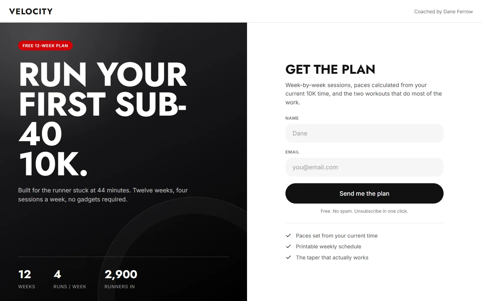
Lead pages in jeruo work this way by default: mobile-first, in the creator's brand, asking for name and email plus consent and nothing else.
Tracking every placement
Use one code per video. A single code reused across a whole channel tells you that QR codes work. It cannot tell you which video or which lead magnet did the work, and that is the question the agency needs answered.
Give the on-screen code its own tracked link, separate from the description link, so scans and clicks sit in different rows. In jeruo, every tracked link has its own QR code, downloadable as PNG for video or SVG for print, drawn in the creator's brand colors with enough contrast for scanners. Set QR code as the link's source and the video title as its label, and every scan that becomes a lead is counted against that video. Name links consistently too: our UTM naming convention covers that in six rules.
What to measure
Read three numbers per video, side by side:
- Visitors from the code against visitors from the description link. If the code brings a small fraction of the traffic, check size and timing first.
- Visit-to-lead rate for each. In the demo workspace, scans convert better than any other source. If yours convert worse than the description link, the page is probably not delivering what the sentence promised.
- Leads per thousand views, so a video with 400,000 views and one with 15,000 can be compared fairly.
A hypothetical example: a video gets 60,000 views. The on-screen code brings 900 visitors and 198 leads, a 22.0% rate. The description link brings 1,500 visitors and 240 leads, 16.0%. Together that is 438 leads, or 7.3 leads per thousand views. If the next video moves the code from the outro to the moment of interest, that last number is the one to watch.
The short version
- Show the code when the problem comes up, not in the outro, and say one sentence about what the viewer gets.
- Make it bigger and hold it longer than feels necessary: dark on light, a clear margin, a short link behind it, tested from the couch.
- Land every scan on a phone-first page that repeats the promise and asks for name and email only.
- Give every video its own code, and compare scans with description clicks by visit-to-lead rate and leads per thousand views.